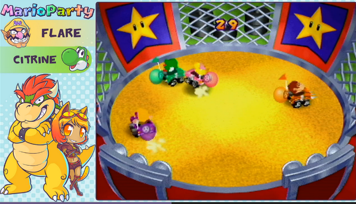
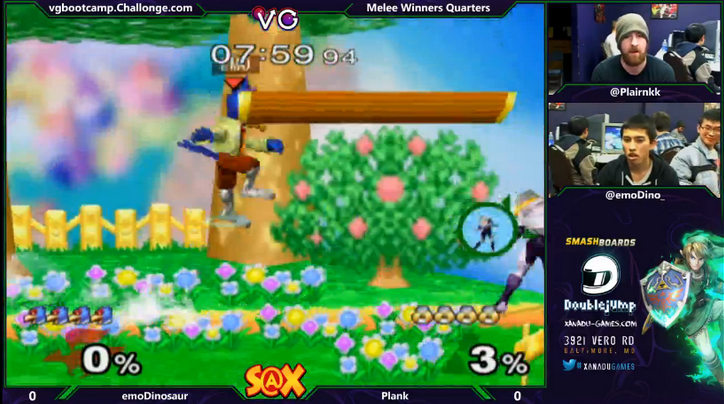
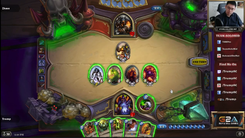
This article is a basic checklist of what you're looking for in a streaming layout. Every stream is different. This is not a be-all end-all list of what to do, but this guide is a good way to get you started in the right direction.
Simply put, keep games, webcams, images, fonts, etc. the proper ratio of height x width. Stretching these things never pays out, and you end up sacrificing quality for filling up space.
Game feed should be the top priority, webcam (if you have it) being second, and all other info after that. Webcams should typically be on the left, so the game feed is centered, considering chat is on the right.
Cool colors (navy, black, and the like) are less attention grabbing than bright colors, which is better if you have negative space to use. Nobody wants to watch eye-blistering hot pink surrounding everything.
One or two fonts is fine, but try to keep fonts harmonized so they are not all over the place. Too many fonts and it can become a big distraction!
Chat on screen can be useful, but it is easily one of the quickest traps you can fall into. Especially just utilizing Twitch's basic chat without any modification, which is bright white, and not very compact. There are two primary reasons people have chat on screen: for mobile users, and for vods later on.
If you're going to opt into chat on screen, try: using an irc program for your chat. Use a black background with white test, and use this instead of Twitch's default.
Game feed is king so treat it as such. Twitch is a video-game streaming website. When considering your layout, think of the way you would want to watch the gamefeed.
Ex: If youtube/twitter is the same, you don't need to have your tag written twice. Just have the icons next to the username, and save space in the process. You don't need to have the whole url on screen either, context clues through the icons and usernames will do the job.
It generally looks tacky and out of place. You are not a human in the depths of blackness, or on a layout. You are in a room. Greenscreen in general requires extremely good lighting and camera to be effective, otherwise it looks just like you're trying too hard.
Basically, don't over-angle things to make artificial depth - tilting adds no value, at the cost of space and information. This is a bad feature in Xsplit. No. Bad dog. Stop that.
You have a title and a description. Use them too! You don't need your life story, your stream schedule, your lasagna recipe, etc on your main layout when you can use your description or title to do these things.
Anything found on twitter.com/badlayouts will give you the right idea of what not to do!
About @BradNThings
I do extremely basic streaming layouts for friends (including the GDQ Showcase Races and various speedrunners - like iateyourpie.) I also doing emoticons and sub icons for Twitch broadcasters as well. I also have an Associates in Graphic Design. My stream is twitch.tv/bradnthings, and I have some highlights of my own stuff there. Feel free to ask me any questions or for any advice regarding layouts. If you're interested, we could arrange a commission. ([email protected] and @bradnthings on twitter also!)


 RSS Feed